My client came to me for help with a brand identity and basic website to outline her services, expertise, and praise. She wanted a brand that stayed true to the sense of strength and justice commonly associated with law, while embodying something slightly more modern.
Colours
Instead of starting with shape, I wanted to start with colour. I knew the right colours would play a key role in making the brand look more modern.
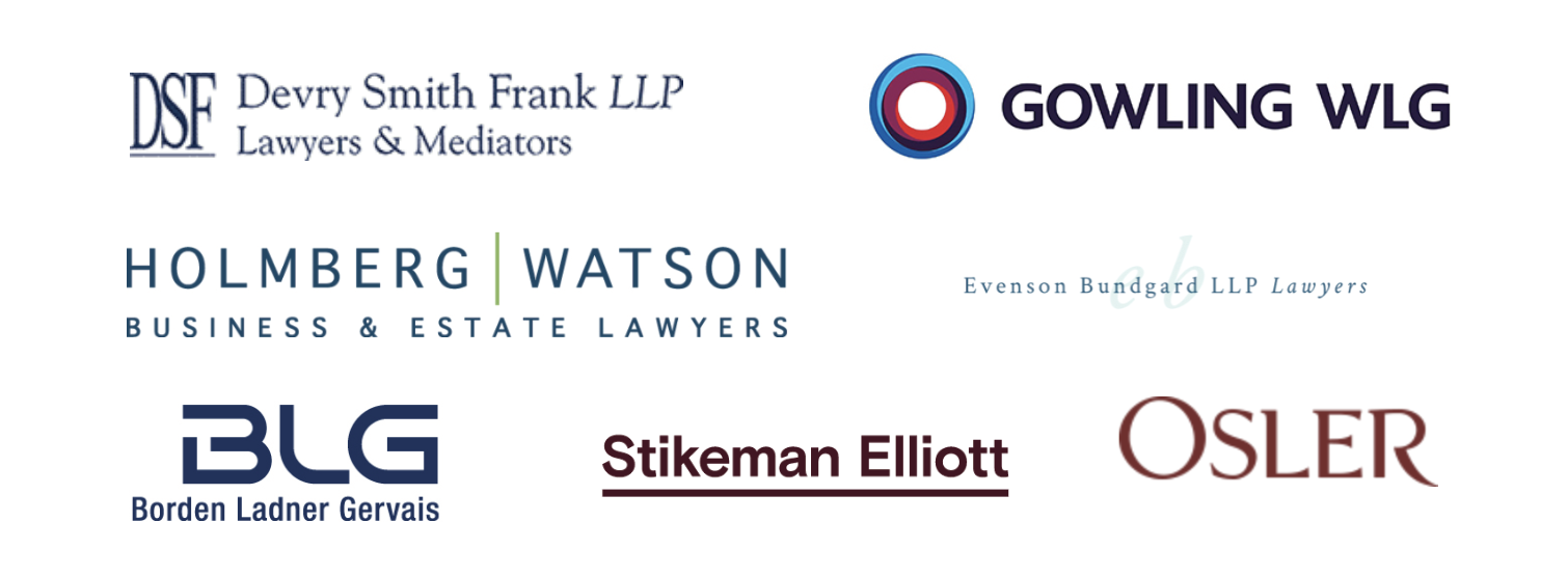
Most law firms in the Toronto area play with dark blues and reds.
To make this slightly more modern, I played with brighter blues, and introduced a gold-hue accent.
#2f505b
#5e8191
#bb8b2d
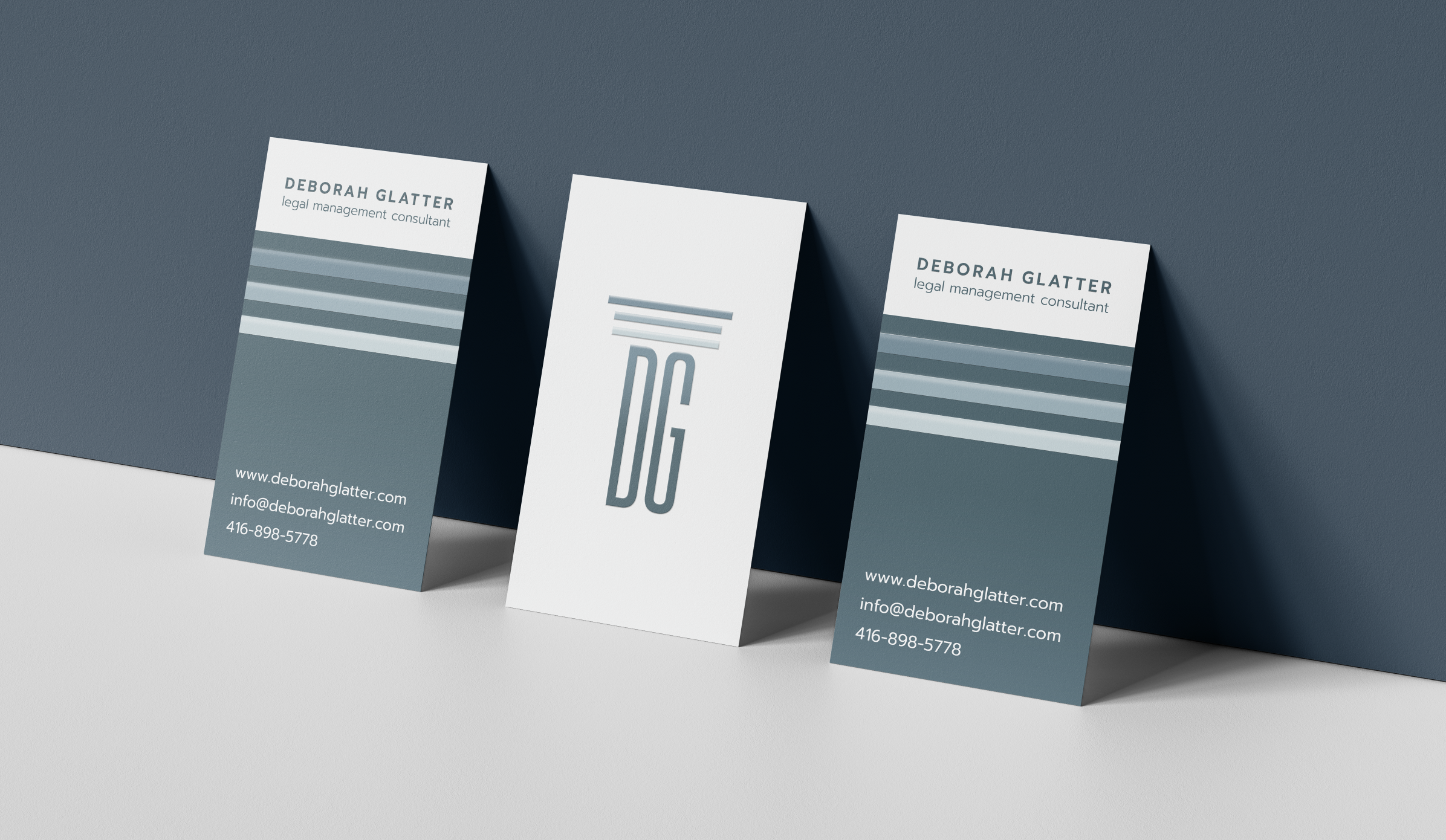
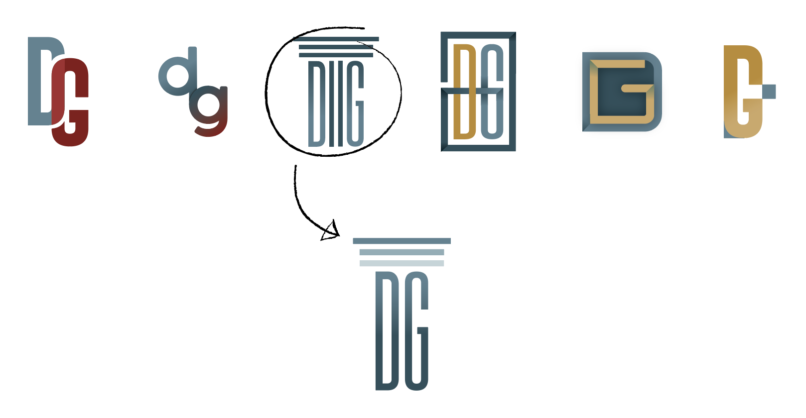
Emblem
Since most law firms use a wordmark as their logo, I thought it was best to use the client’s initials for an emblem. The curvature in the D and G work well together for both upper- and lower-case letters.
After producing a few finished-looking options, the client selected a concept for refinement.
Typography
Prompt
A B C D E F G H I J K L M N O P Q R S T U V W X Y Z
a b c d e f g h i j k l m n o p q r s t u v w x y z