Deliverables
- Branding
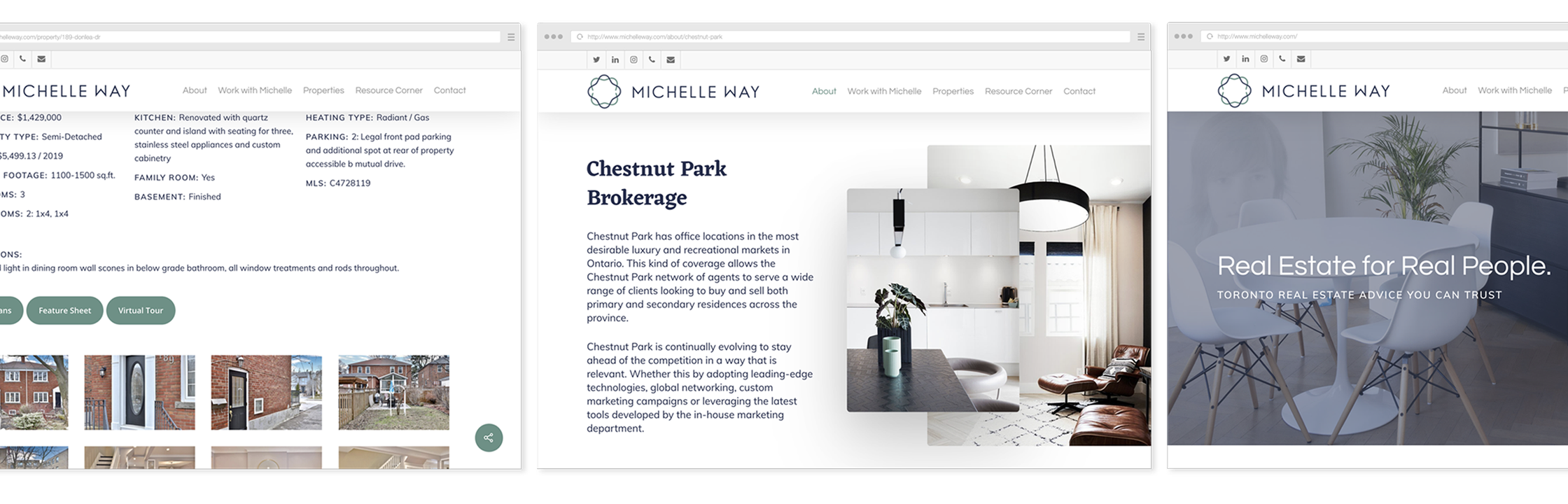
- Website Design and Build
- Copywriting
- Social Media
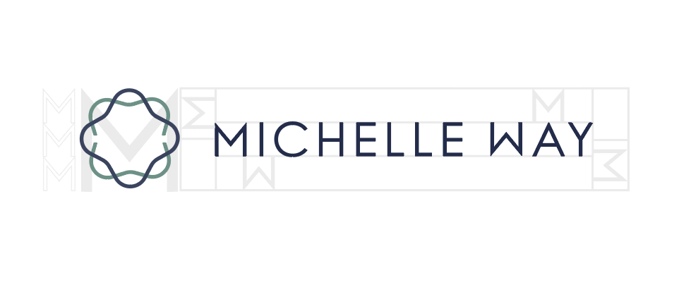
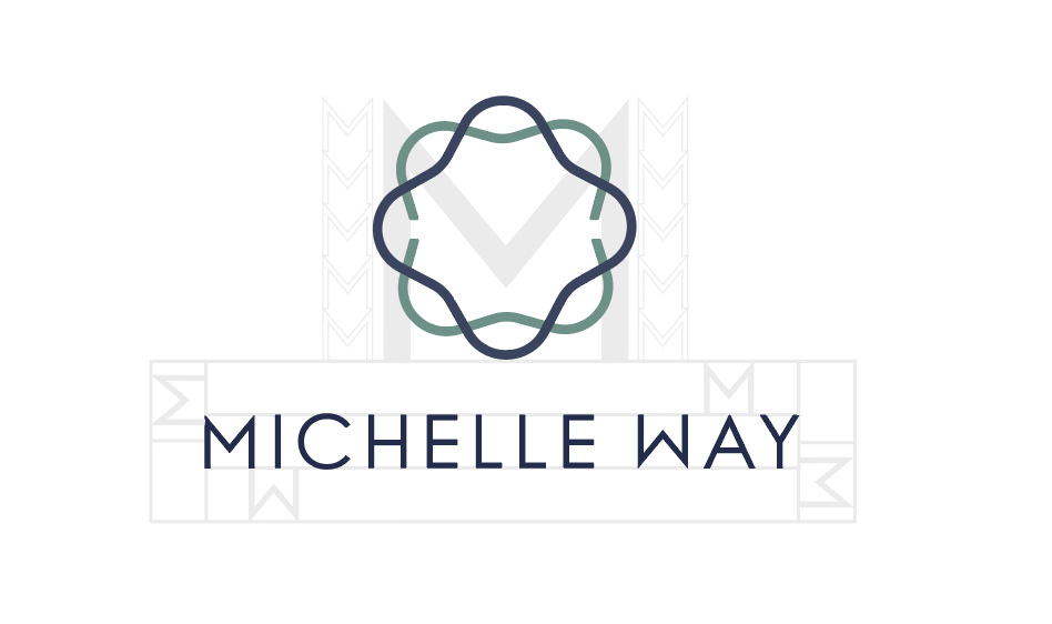
Logo
Designing the emblem began by exploring some overarching concepts: home, direction (a play on the client’s last name), and using the MW from the client’s initials to form an interesting graphic. Below are a sample of the first draft of emblems in the blush scheme that the client was originally interested in.
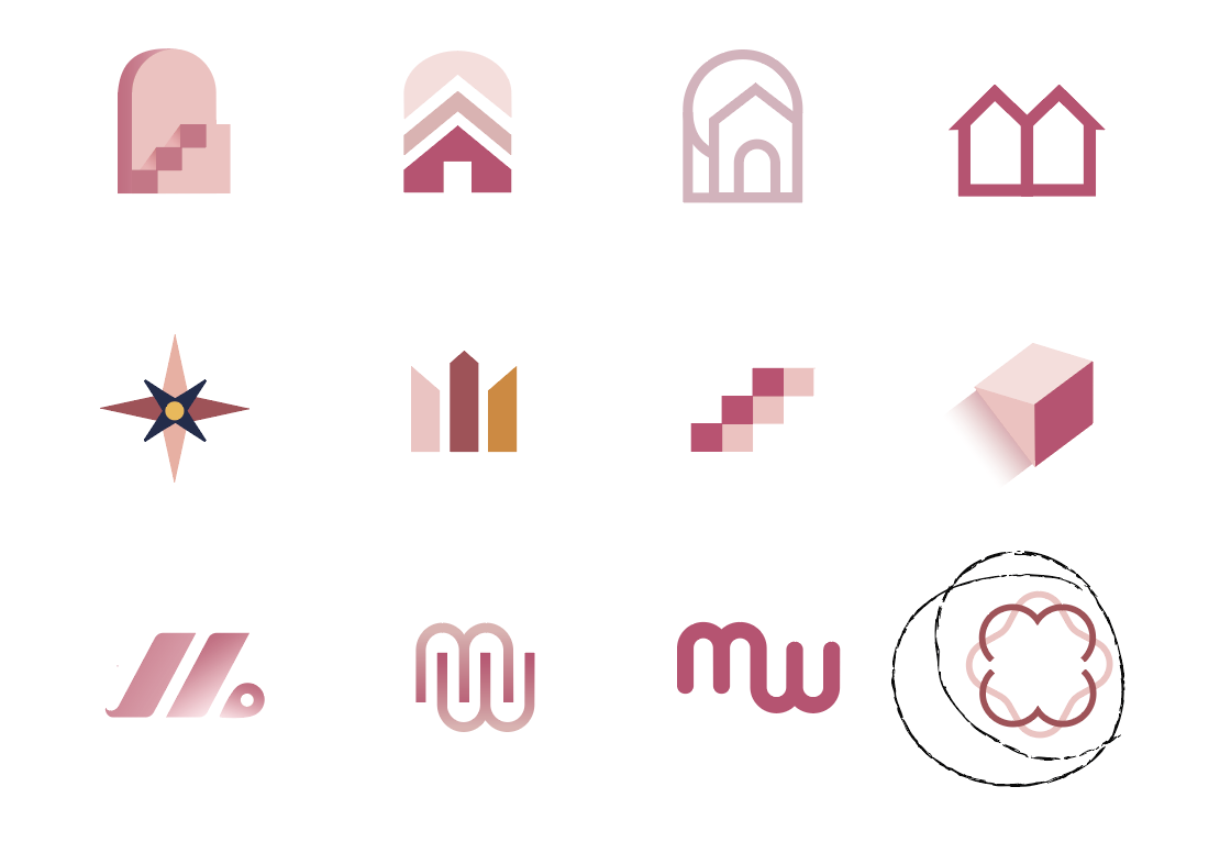
Ultimately, the client wanted a simple shape. The bottom right concept evolved into a more fluid form, and from there we focused on typography and colour.
Typography
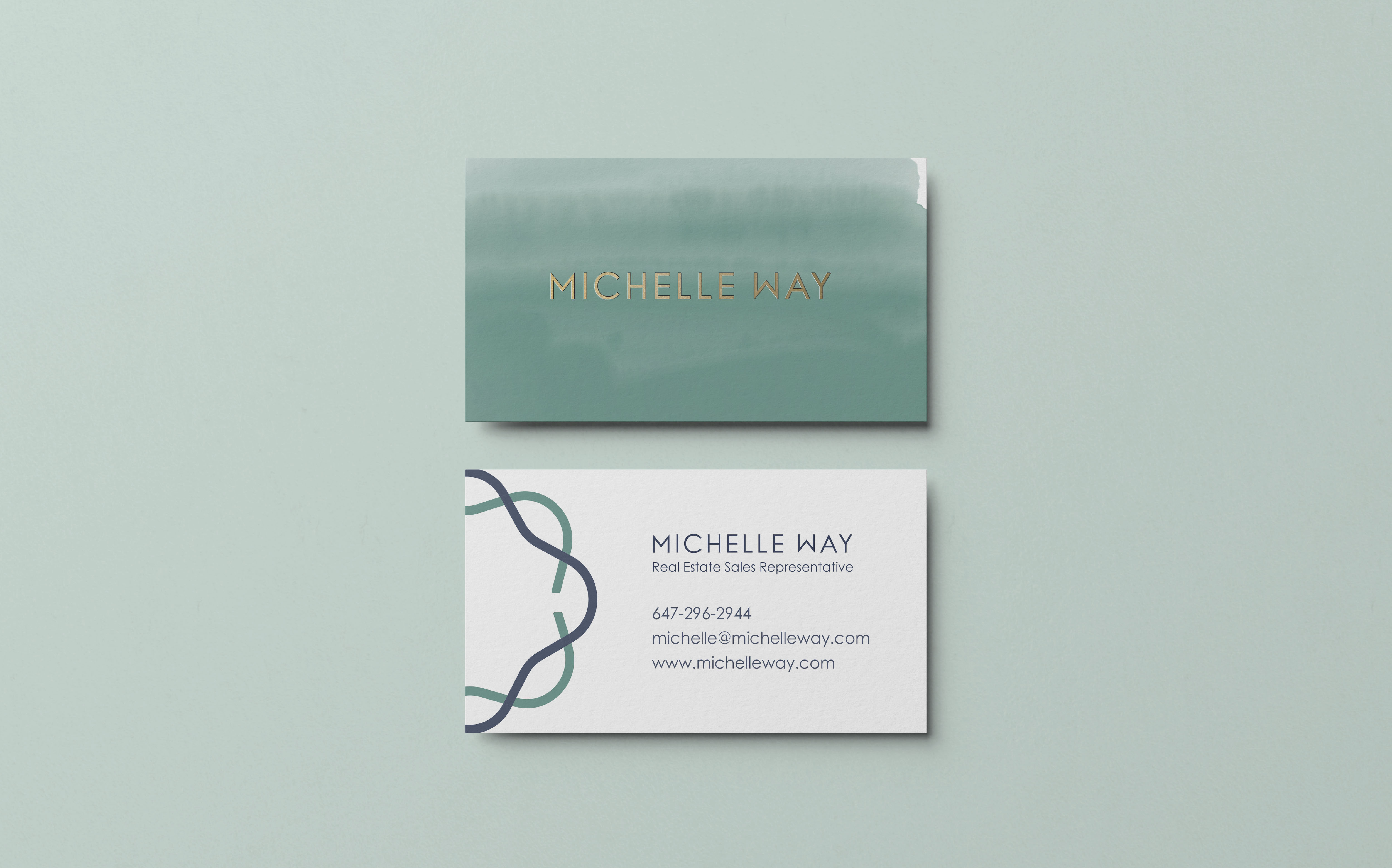
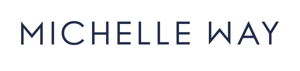
The client came to me with a specific font in mind. It was something she saw on a menu at one of Toronto’s restaurants. That font was Century Gothic.
By increasing the kerning and making a few tweaks to the M and W, so they would be inverted versions of the other, the wordmark was ready to go.
For the website, Questrial, a Google Font is nearly identical.
Questrial
A B C D E F G H I J K L M N O P Q R S T U V W X Y Z
a b c d e f g h i j k l m n o p q r s t u v w x y z
Colours
The goal was to create a brand that is both professional and approachable.
When paired with the simplicity and subtleness of the emblem, blush colours didn’t achieve the right look. After considering some more traditional real estate aesthetics, the blue-green combination offered the right amount of playfulness and sophisticated.
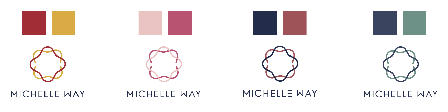
#394460
#639085
#EFEFEF